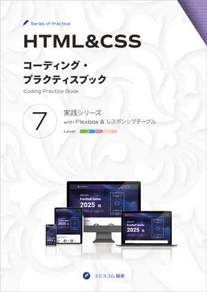
HTML & CSS
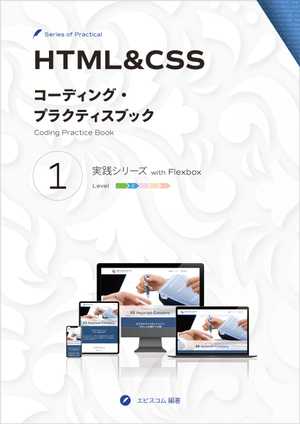
Coding Practice Book 1Practical Hands-on project
with Flexbox
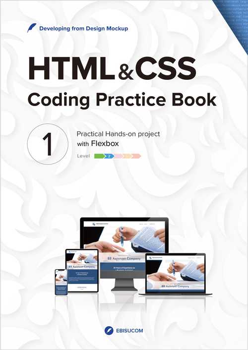
Basic HTML and CSS with Flexbox to create a company website
EBISUCOM / 123 pages / Print Replica format / ASIN:B09L55M44J
―You can read the Print Replica Book via the Free Kindle Reading App (for PC, Mac, Android, iOS) and Fire Tablets. Please check the supported devices before use.
Case Study Details
Here is the PDF for details about the website to be created in the Case Study.
About This Book
This book provides the practical hands-on project for coding a website with HTML and CSS from design mockup and specification.
- The Mockup created with Adobe XD provides a detailed design of a website.
- The Mockup and the Case Study's Code are available for download.
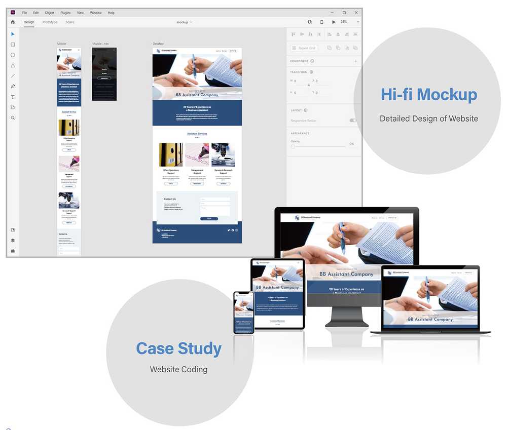
Case Study
One of the coding processes is explained step-by-step as a Case Study.
We will:
- Develop a company website according to the Design Mockup and Specification.
- Layout with CSS Flexbox.
- Make it Mobile-First and Responsive.
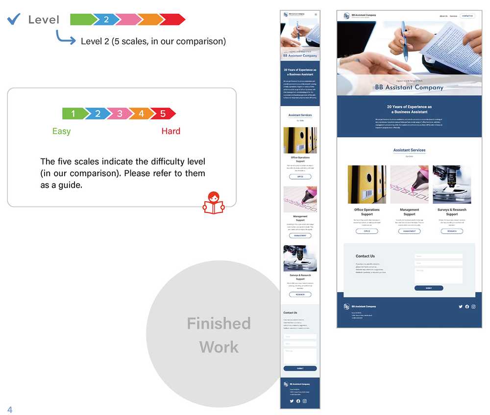
Steps to Create
- STEP 1
Analyze the design mockup and split it into parts. Then plan how to mark them up with HTML and manage their CSS. - STEP 2
Create HTML and CSS files and write the basic settings. - STEP 3 and after
Create each part one by one and construct the website with them. - Finishing and Final Checks
Once the site is complete, check the responsiveness, HTML syntax, and document structure.
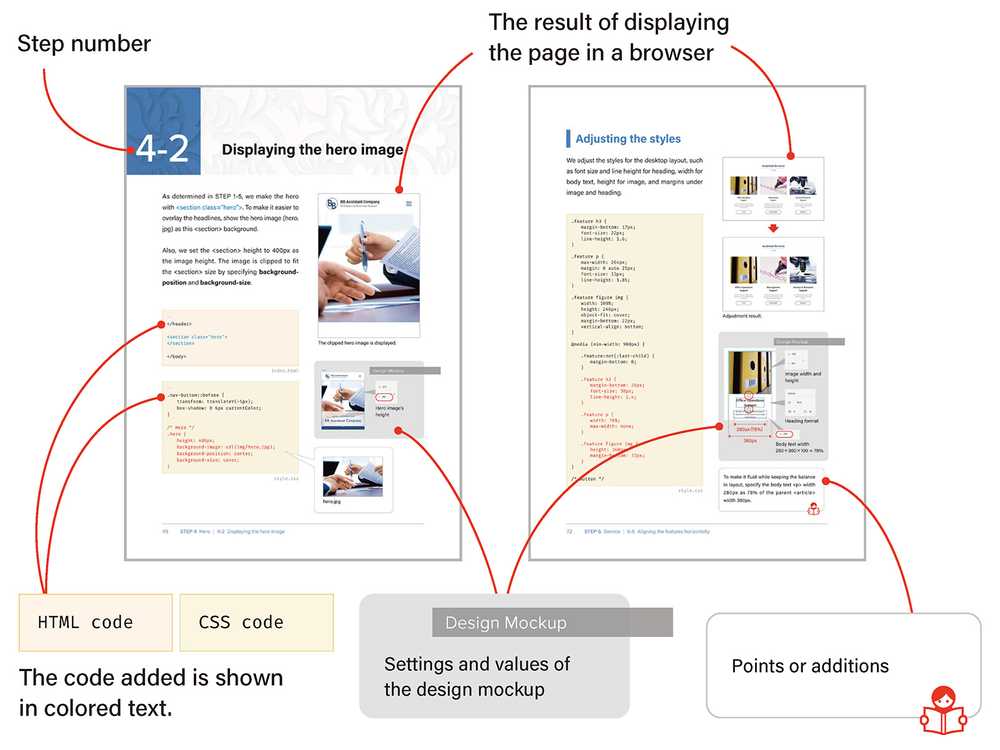
Table of Contents
- Design Mockup and Specification
- Case Study
- Analyzing the Design Mockup
- First impressions of the design mockup
- Coding process and plan
- Basic coding plan
- Splitting the page into parts
- Checking the parts flow (eye flow)
- Planning how to mark up in HTML
- Heading level
- Class name
- Planning how to manage CSS
- Content width with left and right space
- Top and bottom space
- Typography
- Buttons
- Start Coding
- Preparing HTML, CSS, Image files
- Preparing images
- Creating HTML and CSS files
- Writing the basic HTML
- COLUMN How to use Google Fonts
- Writing the basic CSS
- Previewing the page
- Screen size for mobile and desktop
- How to display in specific screen size
- Preparing HTML, CSS, Image files
- Header
- Creating the header
- Displaying the site name
- Aligning image and text
- Adding the navigation menu's button
- Creating lines for the hamburger button
- Adjusting the header content width
- Adapting to desktop
- Adjusting the header content width
- Setting a breakpoint
- Adjusting the site name
- Hero
- Creating the hero
- Displaying the hero image
- Overlaying the headlines
- Adjusting the headline style and alignment
- Reversing the display order of headlines
- Adapting to desktop
- Message
- Creating the message
- Displaying the message
- Adjusting width and spaces
- Adapting to desktop
- Adapting to a smaller screen than the mockup
- Service
- Creating the service
- Adding the title and subtitle
- Adjusting styles for the title and subtitle
- Adding the service features
- Styling the features
- Displaying the feature image
- Adjusting the image height
- Styling the button
- Aligning the features horizontally
- Adjusting the styles
- Aligning button to the bottom
- COLUMN How to align button to the bottom
- Contact Us
- Creating the Contact Us
- Adding the heading and body text
- Adjusting styles for the heading and body text
- Creating the form
- Styling the input fields
- Specifying the field text format
- Styling the submit button
- Adjusting the button style for the desktop
- Adjusting the layout for desktop
- Planning the width for the text and form
- Aligning the text and form horizontally
- COLUMN The form width
- Footer
- Creating the footer
- Displaying the site name
- Adding the address
- Adding the SNS menu
- Adjusting the layout for desktop
- Centering vertically
- Overlapping the parts
- Navigation Menu
- Creating the navigation menu
- Adding the navigation menu as a full-screen overlay
- Adjusting the menu
- Displaying the close button
- Toggling the overlay with button
- Adding the JavaScript
- Adjusting the navigation menu for desktop
- Finishing and Final Checks
- Determining the final breakpoint
- Applying the fade-in effect
- Checking the responsiveness
- Checking the syntax validity and document structure
- COLUMN Heading-level outline and Structural outline
- Analyzing the Design Mockup
※Digital device mockup set designed by rawpixel.com / Freepik
※Ornamental flowers background designed by Freepik
