HTML & CSS
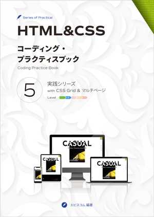
Coding Practice Book 5Practical Hands-on project
with CSS Grid and Multi-page
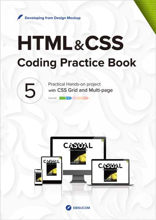
Layering CSS Grid to create a brand site
EBISUCOM / 165 pages / Print Replica format / ASIN:B09Q5MYKYF
―You can read the Print Replica Book via the Free Kindle Reading App (for PC, Mac, Android, iOS) and Fire Tablets. Please check the supported devices before use.
Case Study Details
Here is the PDF for details about the website to be created in the Case Study.
About This Book
This book provides a practical hands-on web project and a step-by-step visually coding guide. You will learn how to create a website from a design and specs.
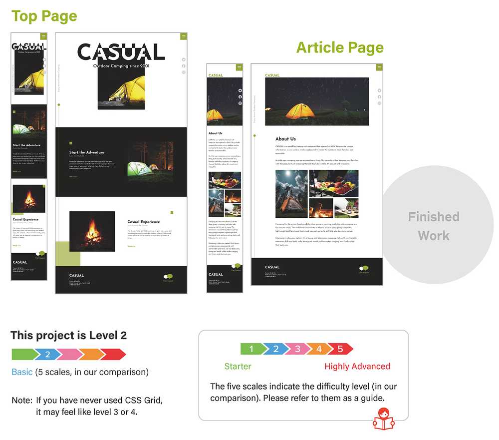
We'll create a two-page outdoor brand site in this project. All assets you need to build a website is available as download.
ASSETS PROVIDED as Download
- XD and Figma design files (Detailed web design mockup)
- Design specs with additional notes
- Image assets
- Complete HTML and CSS code (Case study's code explained in this book)
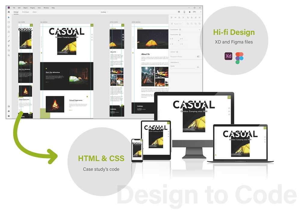
About coding case study
We explain how to code this design step-by-step as the case study.
What you'll learn:
- Basic CSS Grid layout (for mosaic layout, using as layout guidelines, layered multiple grids, and more)
- Coding the Design from scratch
- Mobile-first and Responsive Layout
- HTML with semantics and Simple CSS management
Steps to Create
- STEP 1
Analyze the design and split it into parts. Then plan how to lay them out with CSS Grid. - STEP 2
Create HTML and CSS files and write the basic settings. - STEP 3 and 4
Create CSS Grid (page grid) for the page frame layout with decorative parts. - STEP 5 and after
Create CSS Grid (parts grid) for the main content layout. - Finishing and Final Checks
Once the site is complete, check the responsiveness, HTML syntax, and document structure.
Table of Contents
- Design and Specs
- Coding Case Study
- Analyzing the Design
- First impressions of the design
- Splitting the design into parts
- Common parts that compose the page frame
- Parts that compose the main content
- Planning how to place parts
- Planning how to use CSS Grid
- Grid for mosaic layout
- Grid for using as layout guidelines
- Planning how to control the layout for the main content
- Determining the heading level
- Top page
- Article page
- Coding process and plan
- Basic coding plan
- Start Coding
- Preparing HTML, CSS, Image files
- Preparing images
- Creating HTML and CSS files
- Writing the basic HTML
- COLUMN Google Fonts setting
- Writing the base CSS
- Previewing the page
- Screen width for mobile and desktop
- How to display in specific screen size
- Preparing HTML, CSS, Image files
- Page Grid
- Constructing the page frame with Page Grid
- Creating the Page Grid
- Placing parts on the grid
- Adding the common parts
- Checking auto-placement in the grid
- Specify the placement of parts with grid lines
- Styling the navigation button
- Adding the white lines
- Styling the SNS menu and vertical text
- Styling the SNS menu
- Styling the vertical text
- Setting the footer background-color
- Adapting to desktop
- Checking the Page Grid structure on desktop
- Adjusting the SNS menu position
- Adjust the vertical text position
- Adding the decorative line
- COLUMN The parts size placed on the grid
- Parts Grid
- Adjusting the footer layout with Parts Grid
- Adding the footer content
- Creating the Parts Grid
- Checking auto-placement in the grid
- Placing all grid items into the second column
- COLUMN The line number for the automatically-generated column and row
- Adjusting the footer content layout
- Planning how to achieve the layout
- Placing the content in a row
- Moving the chat icon to the top
- Styling the text
- Adjusting the Parts Grid for desktop
- Checking the responsive layout
- Specifying each column's min-width
- COLUMN Checking the page frame responsiveness
- Main Content (Header Image and Article)
- Creating the main content
- Placing the main content
- Adding the header image
- Adjusting the header image layout
- Adjusting the layout for desktop
- Adding the article
- Adjusting the article layout
- Adjusting the layout for desktop
- Checking the responsive layout
- Photo Gallery
- Creating the photo gallery
- Adding photos
- Making a grid for laying photos out
- Specifying the placement with grid areas
- Changing the grid and area structure
- Adjusting spaces above and below the gallery
- Hero
- Creating the hero
- Creating the top page
- Adding the hero
- Planning how to make the hero part
- Adding and marking up the hero
- Adjusting the hero layout
- Making text and image overlap and invert
- Adjusting the text and image position
- Adjusting the layout for desktop
- Adjusting the responsive layout
- Adjusting the responsive layout for mobile
- Adjusting the responsive layout for desktop
- Adjusting the stacking order
- Message
- Creating the message
- Adding the message
- Planning how to make the message part
- Adding the messages
- Adjusting the layout for mobile
- Adjusting the image and text
- Adding small rectangle
- Adding large rectangle
- Adjusting the layout for desktop
- Aligning horizontally
- Adjusting sizes
- Adjusting large rectangle
- Checking the responsiveness
- Navigation Menu
- Creating the navigation menu
- Adding the menu as a full-screen overlay
- Styling the menu
- COLUMN Difference of justify-items, justify-content, align-items, align-content
- Toggling the menu open and close with the button
- Adding the JavaScript
- Making the menu open and close
- Making the close button
- Making the menu work on the article page
- Checking the menu on desktop
- Making the scroll bar always visible
- Finishing and Final Checks
- Determining the final breakpoint
- For the top page
- For the article page
- Checking the responsiveness
- Checking the syntax validity and document structure
- For the top page
- For the article page
- Determining the final breakpoint
- Analyzing the Design
※Digital device mockup set designed by rawpixel.com / Freepik
※Ornamental flowers background designed by Freepik
